


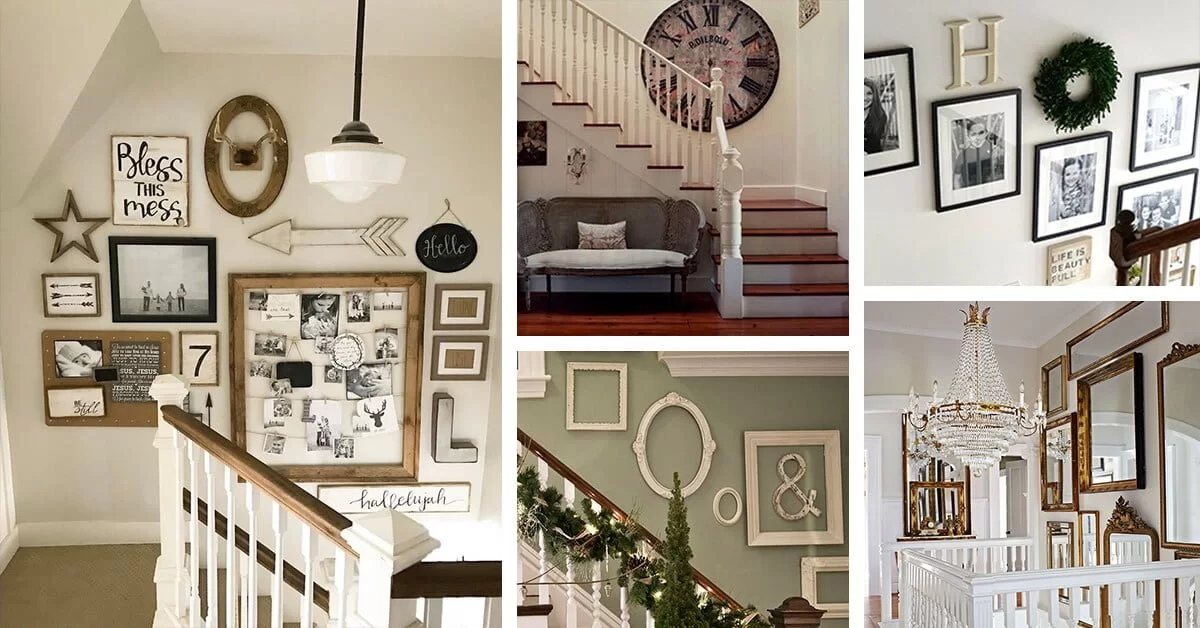


This is probably the least technical “how to” post that will ever be written. But I think it might be one of the most helpful, because committing to hanging a gallery wall is the hardest part. I’m here to help those of you who, like me, want to hang an “imperfect” gallery wall. Gallery walls can be a little daunting but they really don’t have to be too complicated. So here’s how to arrange a stairway gallery wall by eyeballing it. I’m also including links to all of my art at the bottom of this post!
Getting Started

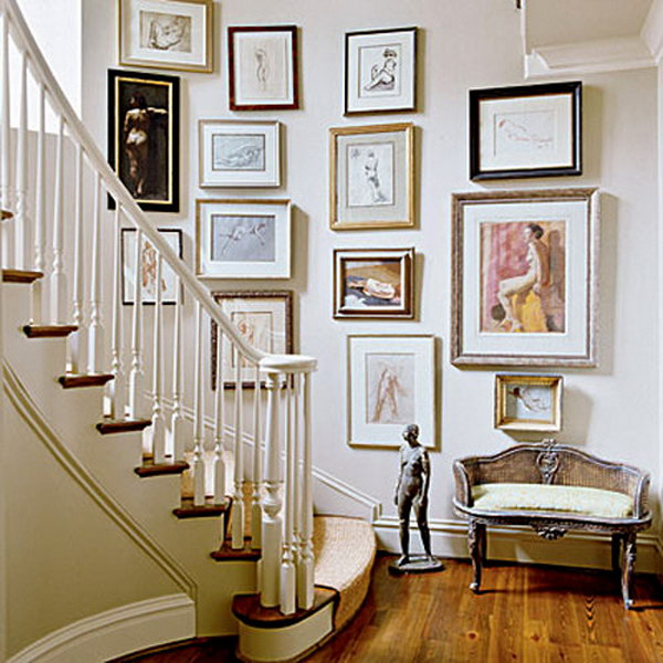
Over a year after moving into our house, I snapped a photo of the entry and realized how empty it looked. A gallery wall was the answer. We used a few pieces we already had, ordered a framed print from Anecdote, and three framed photographs from Sonic Editions. We didn’t include family photos since we already had them elsewhere in our home.
Adding a Stair Runner
The first step was adding a runner for safety and comfort. I once slipped on the stairs while carrying Margot, which pushed us to install one. I initially got a quote for over $3,000, but later worked with interior designer Kira David who sourced a padded, soft sisal runner for less than half that price. We chose “Paradise in Cobble” from DMI.
Baby Gate Details

Some parents wait to see how their toddlers handle stairs. Margot wasn’t a climber, so we didn’t install a baby gate immediately. You can read more about baby-proofing our home in another post.
My Gallery Wall Layout Process

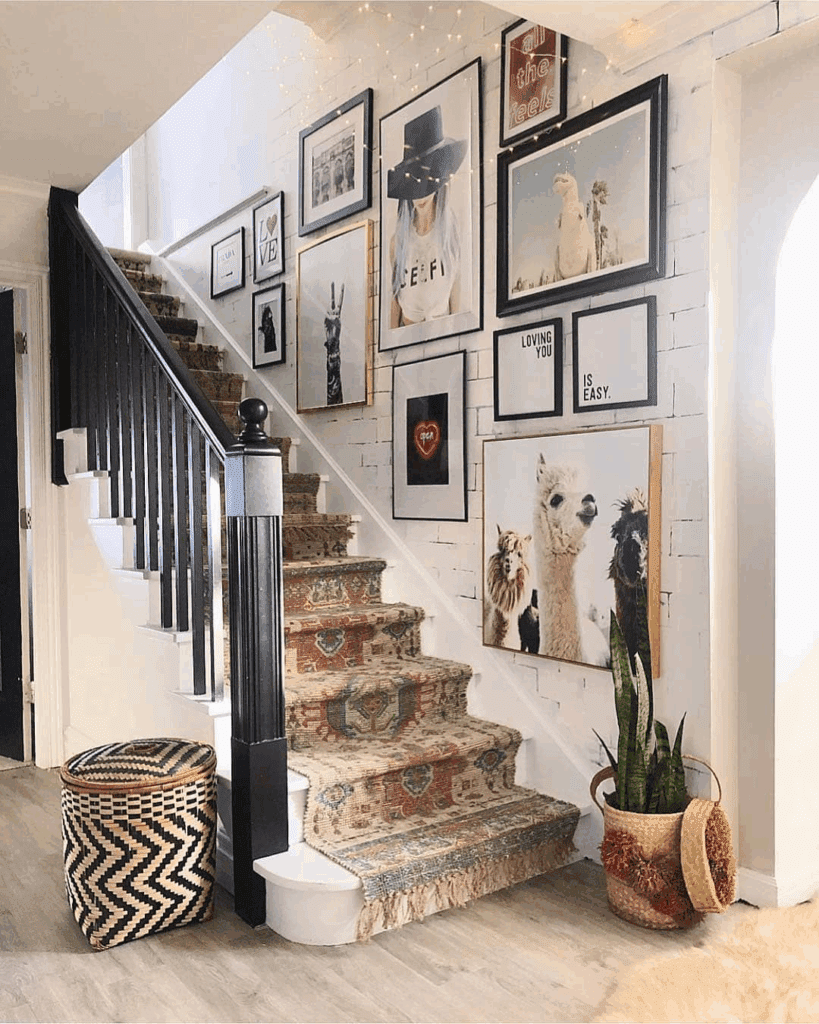
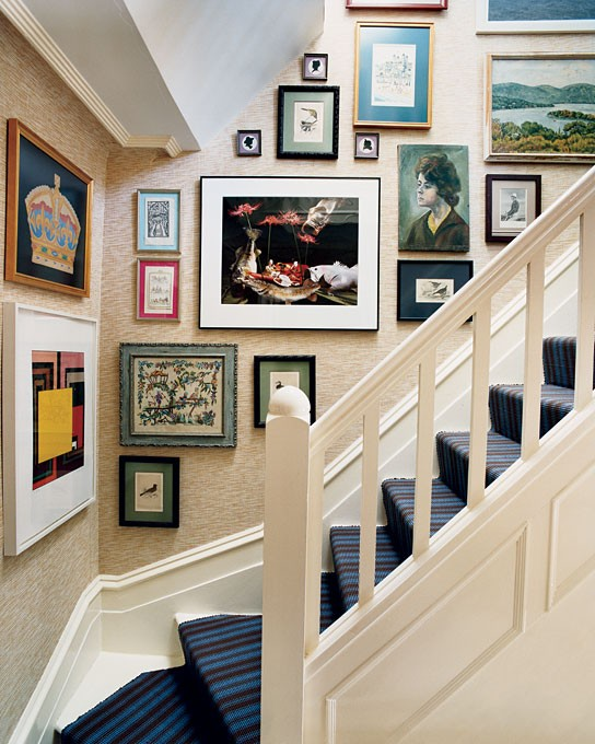
If you want to cover an entire wall in art, this process is for you. Start with a mix of portrait and landscape frames. The layout should feel eclectic and casual. This works not just for stairs but dining rooms or any blank wall.
What You Need
- A blank wall
- A variety of frames
- Art prints (photography, illustrations, etc.)
How to Start
We hung pieces one by one, without a mapped-out plan. Conor would hold a piece up while I decided placement. We avoided clustering similar types of art (like photographs) or identical frame colors next to each other.
Template? Not Really.
There isn’t a rigid template for this style. You don’t need matching frames or perfect alignment. Start with the largest piece and fill in the rest with smaller ones.
Mistakes to Avoid
- Too much or too little space between frames
- No variation in frame styles or sizes
- Over-clustering similar media or colors
“Going for It” Strategy

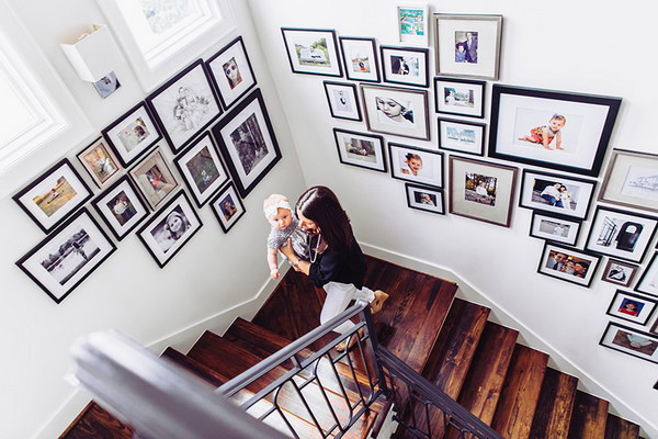
We went with the “go for it” approach, adjusting as we hung each piece. We didn’t focus on a single focal point but let variety take the lead. The white frame with a Paris photo went up first, followed by a vintage engraving and a Brigette Bardot photo.
Working from Bottom to Top
We started “low” and worked our way up the stairs. Top placement can be tricky, so adjusting height as you go is helpful.
Enlist Help
Have someone hold the frames while you step back and evaluate. Take photos from different angles. It’s easier and more enjoyable than using laser levels.
Remember: It Doesn’t Have to Be Perfect!
It’s ok if spacing is a little off. A bit of breathing room or visual imbalance adds to the charm. Try different arrangements before committing.
Finishing Touches
We realized the wall needed one more piece—something gold—and that the lowest artwork was slightly too high. These small tweaks made the overall layout feel complete.
Also Read : DIY Accent Wall Ideas for Small Bedrooms That Wow