Sometimes, playing it safe just doesn’t cut it. It’s those wonderfully strange, offbeat paint colors that truly breathe life into a room. The right shade can transform a space from dull to electric, sprinkle in surprise and playfulness, or even mess with your sense of space — in the best way.
As designer and architect Ryan Brooke Thomas puts it, “Weirdness isn’t always loud or quirky. Sometimes, it’s about being mysterious and unique.” In color, that mystery comes from subtle tones that surprise and harmonize with the rest of the room’s textures and materials.
Here, nine designers share the unusual hues they’ve loved, used, and couldn’t get enough of — whether in their own homes or for clients who dared to be different.
The Natural Habitat by Backdrop
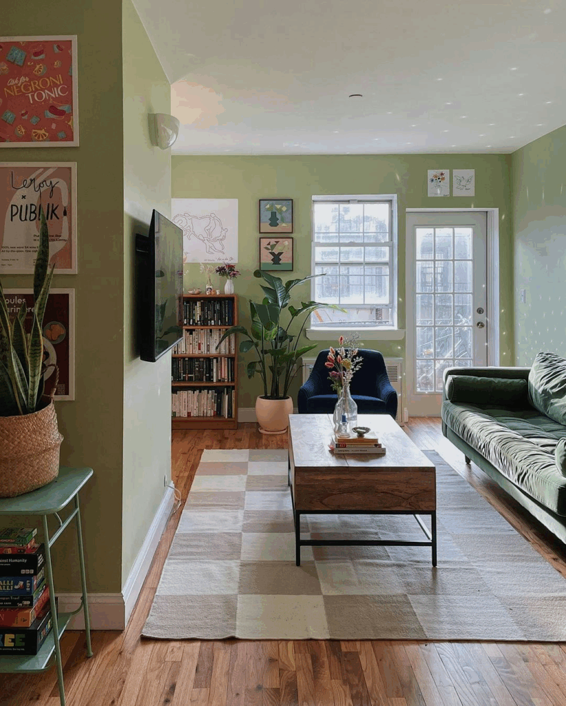
Pale avocado green that’s playfully retro and totally charming.
Instead of going for a simple neutral to balance darker tones, Studio Keeta went with a pale avocado shade in this kitchen — a color that feels nostalgic yet fresh. Kristina Khersonsky explains, “Avocado green takes me straight back to retro 1950s kitchens, but here it’s anything but dated. It playfully stands out without screaming for attention. In our Weho Bungalow project, it perfectly harmonized with a cobalt blue backsplash tile and deep walnut countertops. It tied the whole kitchen together with just the right touch of eccentric charm.”
Copper Clay by Benjamin Moore
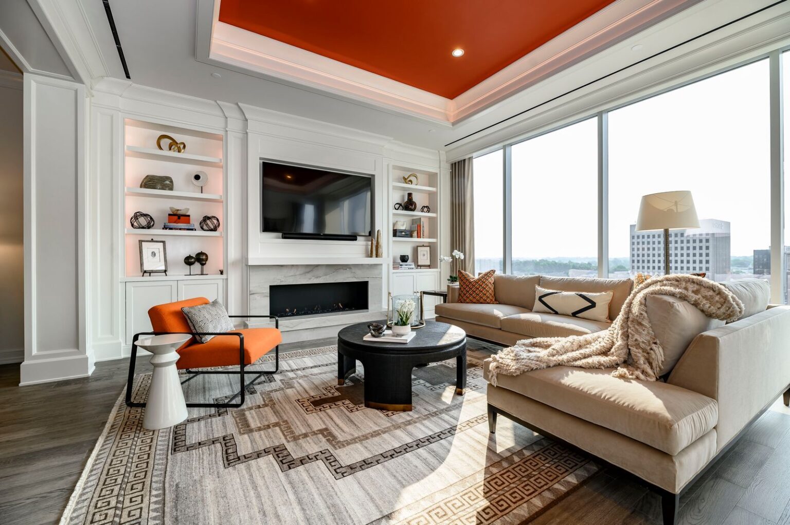
Warm, cozy orange that surprises you from above.
Orange can be a tricky color — some people love it, others shy away. But Margaret Cashman used Copper Clay on the ceiling of a living room, and the result? Pure magic. “At first glance, you think the room is just clean and white,” she says, “but then your eyes catch that glowing, warm orange overhead. It adds this cozy, unexpected warmth without stealing the spotlight from the incredible city views.”
Little Black Dress by Behr

All-black everything — and it’s anything but dark.
Black walls and ceilings might sound intimidating, but Hema Persad’s dining room proves the opposite. “People often think painting a room black will shrink it or make it gloomy,” she says. “But in this case, it created a cocoon of coziness. The ceiling seems to disappear, making the space feel infinitely tall and intimate at the same time. It’s like wearing your favorite little black dress — classic, bold, and effortlessly chic.”
New Lime by Benjamin Moore

Electric lime that zings with life and energy.
Nicole Lanteri was after something bold and unexpected for her kitchen cabinets — and boy, did she find it. “New Lime is like a shot of adrenaline,” she shares, “a punch of happy energy any time of day. We started with black-and-white terrazzo floors that grounded the space, but this neon lime brought in so much personality and joy. Later, we even painted the fireplace the same color — it’s edgy and fun, balancing the moody walls and furniture with a fresh burst of life.”
Negroni by Backdrop
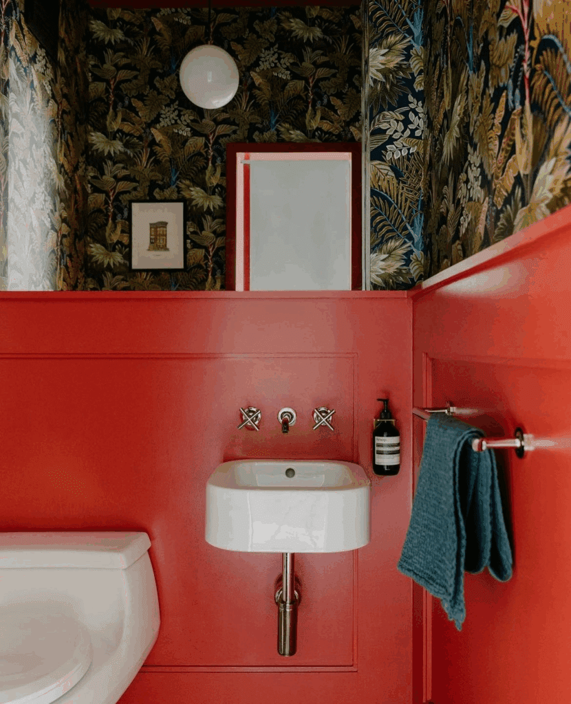
Tomato red with a tropical twist.
Emma Beryl’s client’s powder room dared to be different with a dark tropical wallpaper — but what about the paint? “We picked Negroni, a bright tomato red that’s rarely seen on walls,” she says. “It brought the whole room together with a lively, joyful punch — a fun little secret to delight a young family every day.”
Bamboozle by Farrow & Ball
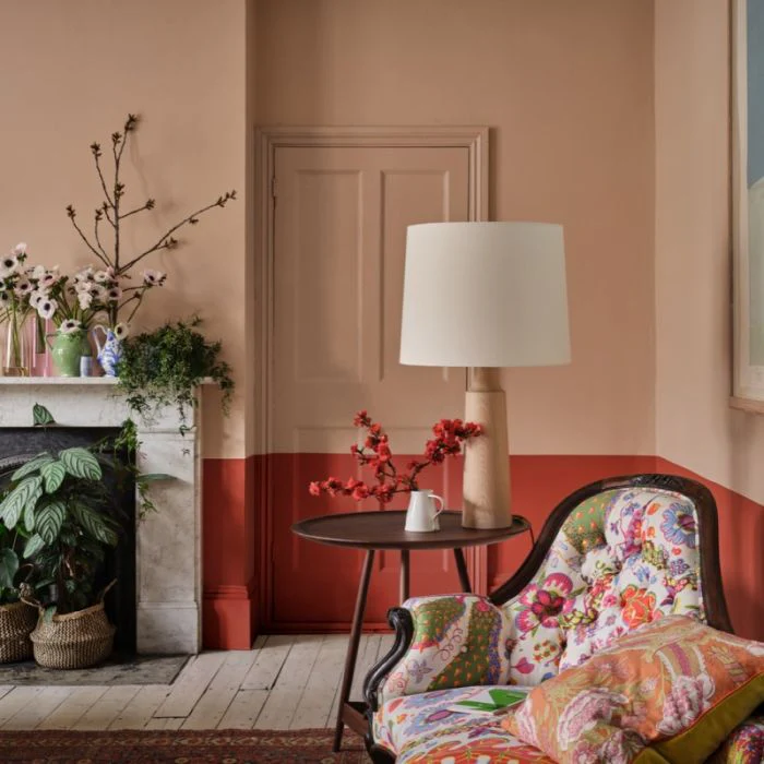
The name says it all — a punchy, stop-you-in-your-tracks red.
Designers Kristine Renee and Deborah Costa say this red is exactly what it promises: bold, surprising, and impossible to ignore. “We painted windows, doors, and a built-in bar with Bamboozle — and it totally transformed the space. Who doesn’t want their home to be bamboozled by color?”
Refined Green by Dunn-Edwards
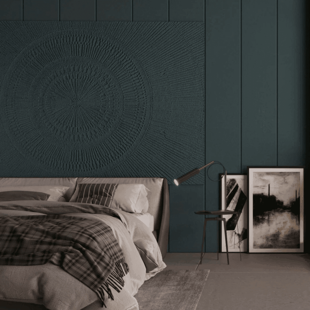
A deep oceanic blue-green that’s both a pop and a grounding force.
Ryan Brooke Thomas loves to bring green into her projects but always searches for a shade with personality. “Refined Green is special — it reads as a punch of color next to lots of black, yet it feels anchored and adds incredible depth. It’s the kind of green that makes a kitchen feel both graphic and inviting.”
Also Read : 5 Biophilic Bathrooms That Let You Breathe With Nature

